CASE STUDY / 01 · DRIVER ONBOARDING

Driver
Onboarding

for Ride-Hailing Apps

A UX research & design case study on simplifying the complex driver sign-up process across Uber, Ola, Lyft & InDriver — collapsing 13 painful steps into 2 clean screens.

UX ResearchInteraction DesignMobile App2024
scroll to explore
02
The Problem

The Pain of
Getting Started.

For millions of drivers, signing up with ride-hailing platforms is an 8 to 13 step ordeal of forms, uploads, and confusing instructions with no visibility of what's coming next.

"I didn't know I needed a police clearance until step 9. I had to restart the whole process."

— Driver interview, Bangalore
8–13
Steps in current onboarding flow
62%
Users confused by excessive UI text
53
Drivers interviewed across 4 apps
0 / 4
Apps with a clear document checklist
03
Research & Methodology

What We
Discovered.

We tested Uber Driver, Ola Partner, InDriver & Lyft end-to-end and interviewed 53 drivers who had used at least 2 of these platforms.

App Testing53 InterviewsCompetitor AuditHeuristic Eval
Wireframe flow
01
No document preview
All 4 apps fail to tell drivers what documents they need before starting — causing panic and mid-flow drop-off.
02
UI information overload
62% of drivers found too much text overwhelming. Dense layouts triggered confusion, anxiety, and abandonment.
03
Zero reupload clarity
When a document was rejected, there was no in-app path forward. Drivers waited days for a customer care call.
04
Third-party dependency
Drivers relied on friends, agents, or call centres to complete sign-up — a total failure of self-service design.
06
Design Process

How We Got There.

01
Empathize
53 driver interviews across 4 platforms
02
Define
HMW statements & insight synthesis
03
Ideate
Sketching, card sorting, sprints
04
Prototype
Wireframes → Adobe XD prototype
05
Test
Usability testing with 12 users
07
Solution & UI Design

Less Steps.
More Clarity.

The redesign collapses everything into 2 screens: Personal Details + Vehicle Details. Language selection first. Every field has an inline help icon.
Language First
Driver selects language before anything — reducing cognitive friction immediately
2-Screen Flow
All sign-up condensed into Personal + Vehicle Details screens only
Help on Demand
Info icon next to every field — guidance without cluttering the UI
Document Status
Dedicated screen shows pending/rejected docs — eliminating support calls
01 Splash & Language
02 Personal Details
03 Vehicle Details
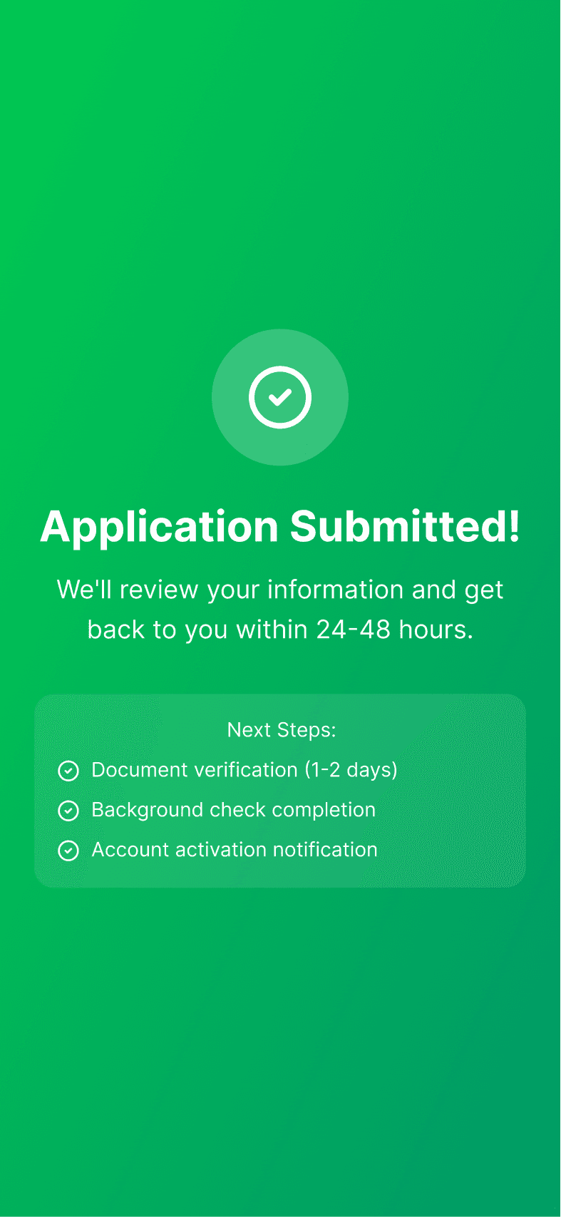
04 Application Submitted
09
Before & After

The Transformation.

BEFORE
Current State
8–13 step process with no end in sight
No document checklist before starting
Zero language support for regional users
Cluttered UI with excessive text blocks
No reupload or pending state in-app
Entirely dependent on customer care
AFTER
Redesigned Solution
2-screen flow: Personal + Vehicle Details
Full document list shown before you begin
Language selection on the very first screen
Minimal UI — help icons only when needed
Dedicated pending & reupload status screen
100% self-service — zero support calls
10
Outcome & Impact

What This
Unlocks.

This design reframes onboarding as a service — not a gatekeeping process. The driver's time is respected. The journey is made human.

0
Reduction in onboarding steps
0
Faster time to go live
0
Self-service capable
0
Support calls required

Create a free website with Framer, the website builder loved by startups, designers and agencies.